Using graphs within reports
Some reports have an option to summarize information in a graph format. You can choose this option by selecting the <Report name> summary option and then specifying a Graph type.
JavaScript must be enabled for the graphs to be visible.
There are four graph types in Bravura Security Fabric , two of which are alike:
For all graph types, individual sets of information are color-coded. Hovering over an element of the graph displays its name and associated value.
The sections of the graph are also identified in the label box. Hovering over a label highlights the corresponding section on the graph. You can filter out unwanted data by clicking on the colors in the label box.
If a report supports multiple graph types, you can switch between types, without having to run the report again, by clicking a radio button below the graph.

Horizontal and vertical bar charts
The horizontal and vertical bar chart types display information in opaque bars that stretch across the screen.
The chart has two axes, one of which divides the subsections of the report output into bars and the other of which displays the associated amount.
The vertical bar chart type often represents trends on a timeline. In this case, each individual unit of time has its own set of bars. If available, you can use a Reporting time interval option to set the unit of time to sort the timeline. Navigate the timeline using the mouse.
A horizontal bar chart may have a Number of rows for graph setting which limits the number of rows displayed within the graph. To reduce clutter on the page, there is a hard limit of 100 rows to this setting.

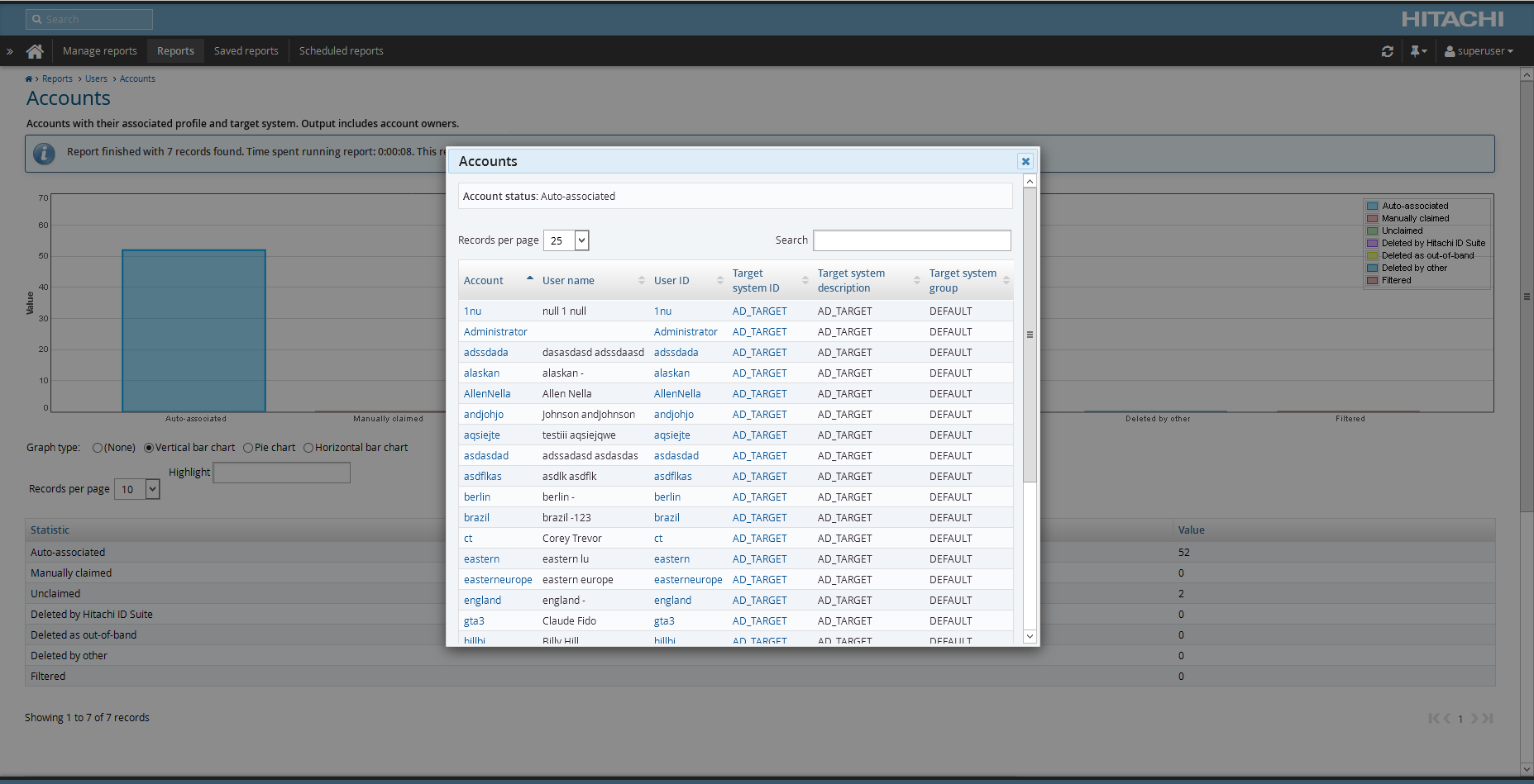
For horizontal or vertical bar charts you can click on an individual bar to view detailed data in a pop-up window.
Pie chart
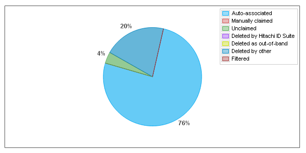
The pie chart graph type represents the summarized report output within a circle, with each subsection of data having its own sector of the circle proportional to the amount it is associated with. The specific percentages of the sectors are displayed next to them.

For pie chart graphs, you can open the drill-down window by clicking on the colored sectors of the pie chart.
You can click on an individual sector to view detailed data in a pop-up window.
Line chart
The line chart graph type displays information from the report using nodes, which are linked together using lines.
This graph type is used to represent trends on a timeline. Each individual unit of time has multiple nodes on the graph. If available, you can set the unit of time to sort the timeline using the Reporting time interval option. Navigate the timeline using the mouse.

For line chart graphs, you can view detailed data in a pop-up window by clicking the nodes on the chart.
Since there are often multiple data lines in one line chart, at times the nodes on the lines will intersect. In this case, clicking on the node opens a drop-down menu that allows you to choose the line for which you want to view detailed data.
View data in drill-down reports
You can get a more in-depth representation of the data in any graph by clicking on an area in the graph or on any row within the table below the graph. This opens a pop-up "drill-down" window that tables data from a specific section of the graph.
Each graph type has a slightly different way of opening the drill-down window which is covered in their respective sections.

A basic search box within the window allows you to filter data within the table.
Unlike other Bravura Security Fabric pop-up windows, the graph drill-down window can be resized and moved around the screen to your liking.
To leave the drill-down window, either click the close icon on the top right-hand side of the window or press [Esc] .